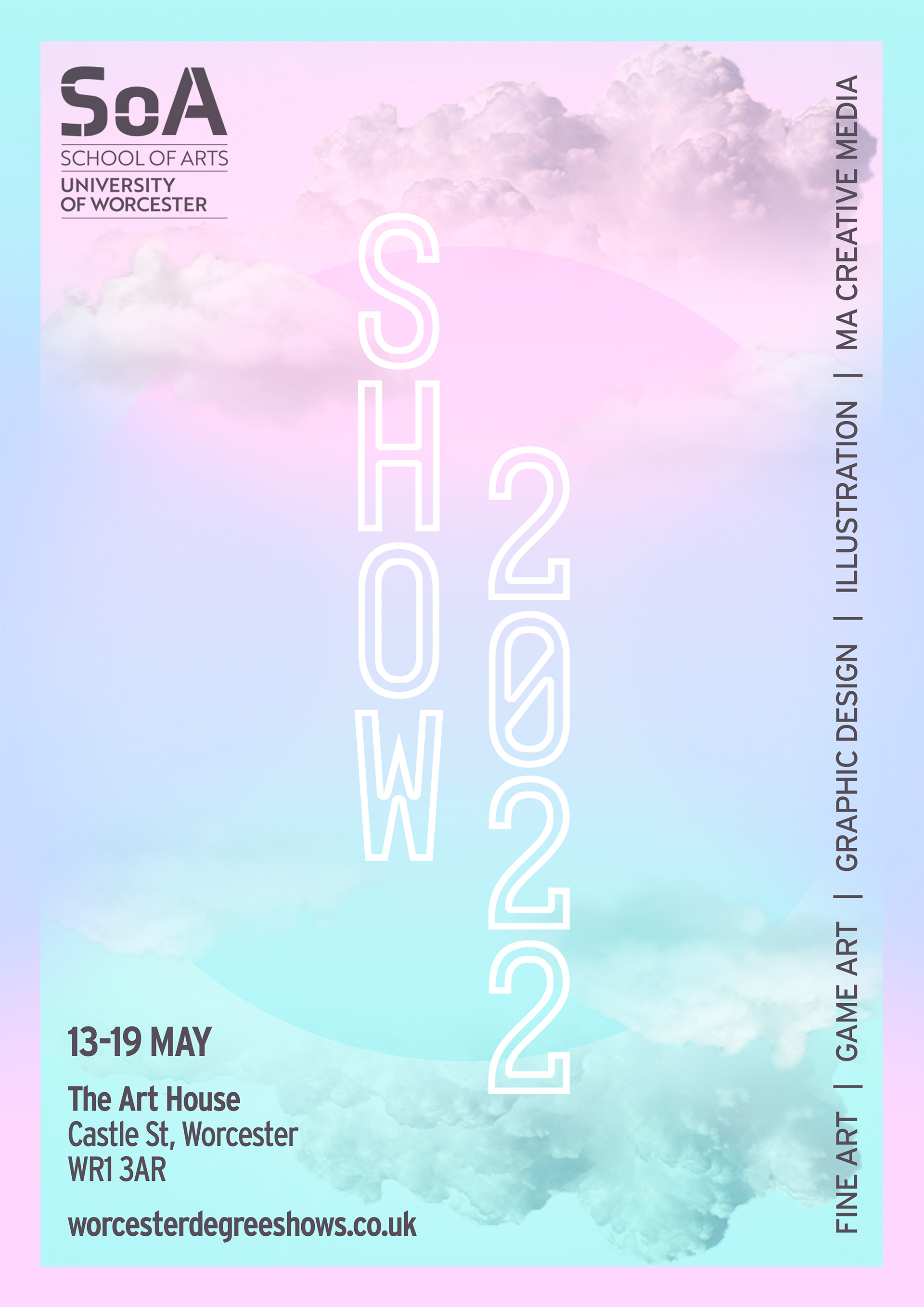
In the module 'Design Awards & Exhibition', we were tasked with creating the poster for the year-end degree show.
My style is often quite black and white, with lots of contrast, and bold colours, so for this project I really wanted to do something completely different and stand out from my peers.
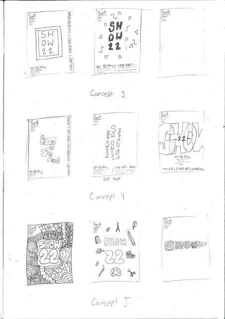
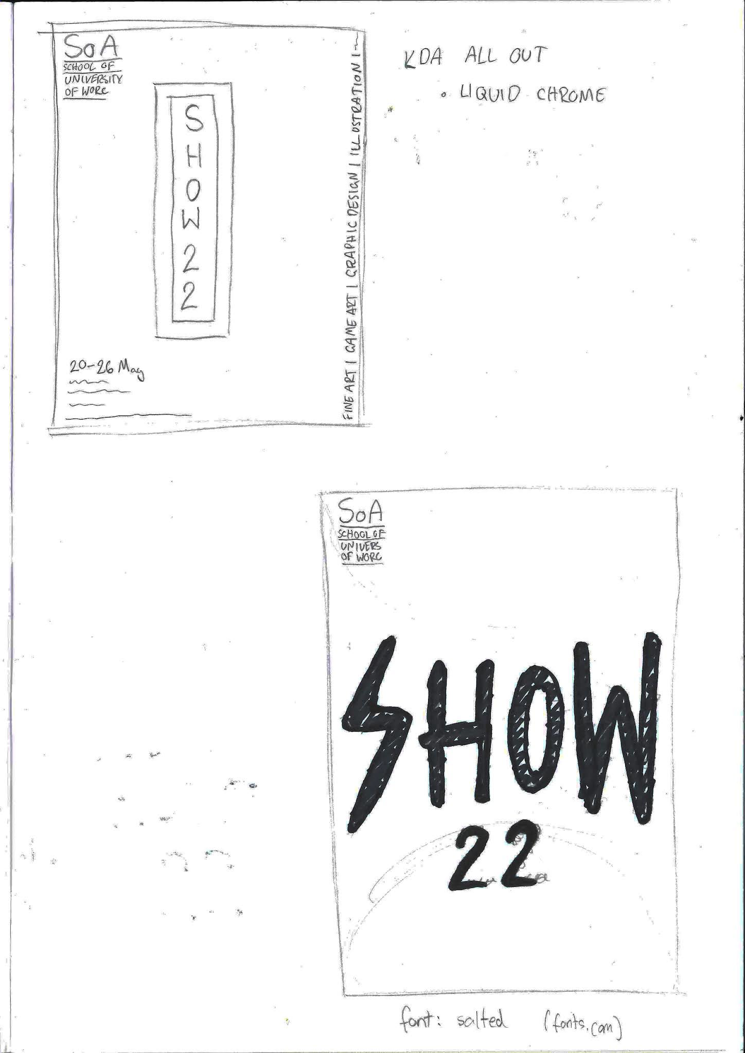
I did a ton of research as we had no real guidelines to follow so we could do whatever we wanted. I did seven different concepts and three sketches for each one.
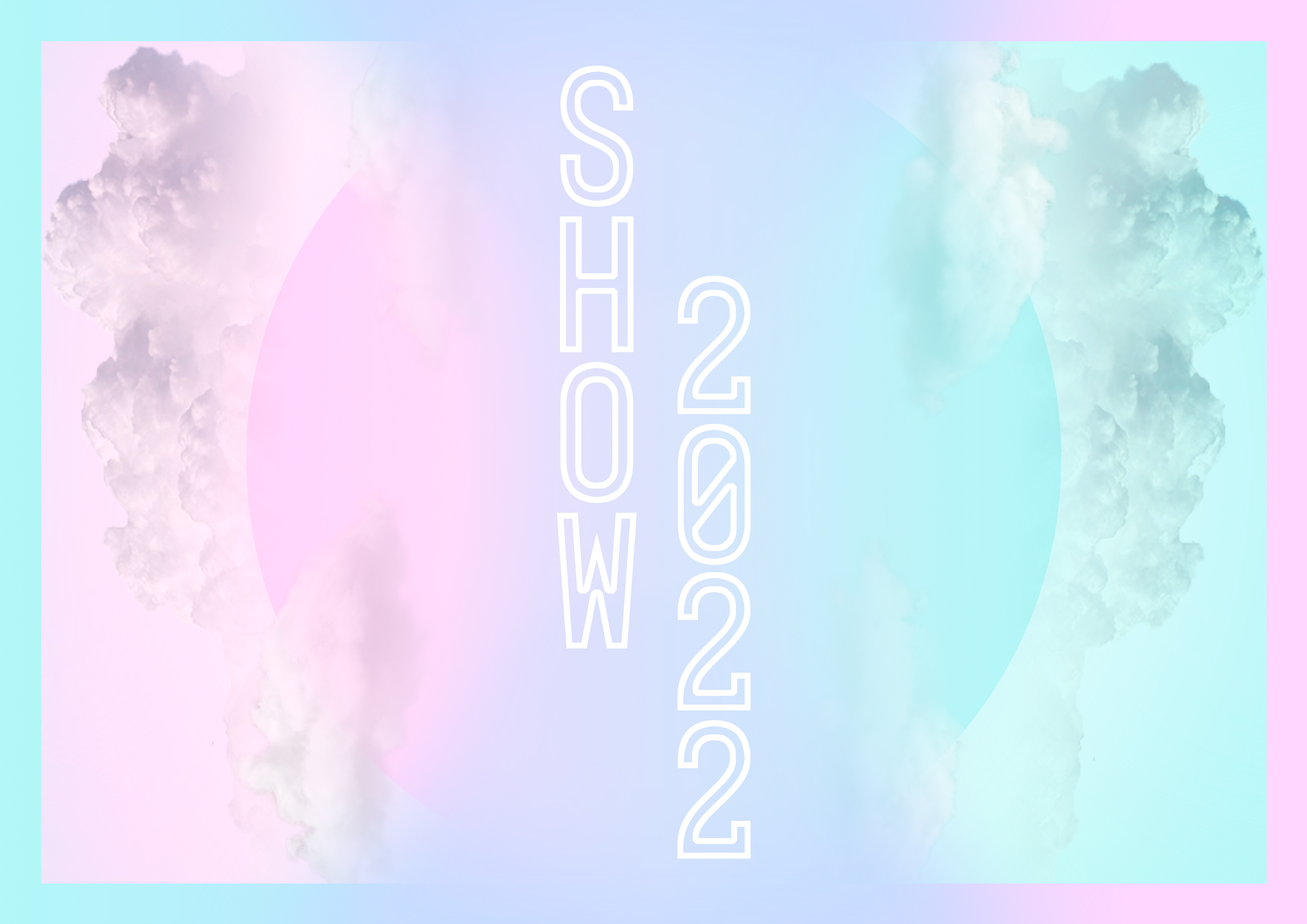
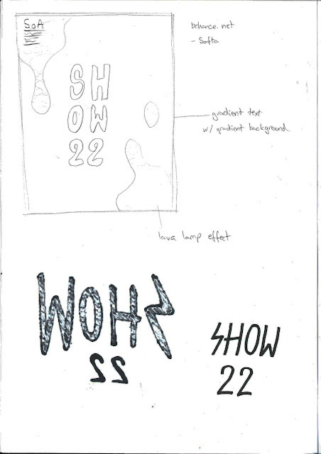
I adore Japanese art and graphic design, and I was inspired by several artworks that used gradients and circles as well as landscapes. I felt this was the way to go as no one else was doing anything with pastel colours so I knew mine would stand out from the crowd.
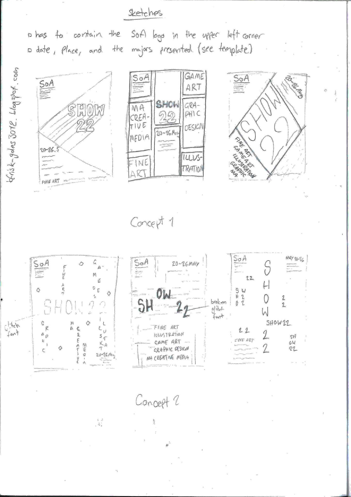
First set of concepts
Second set of concepts
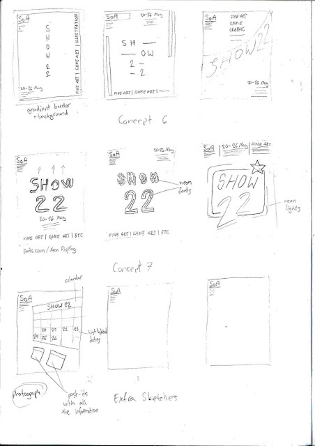
Third set of concepts
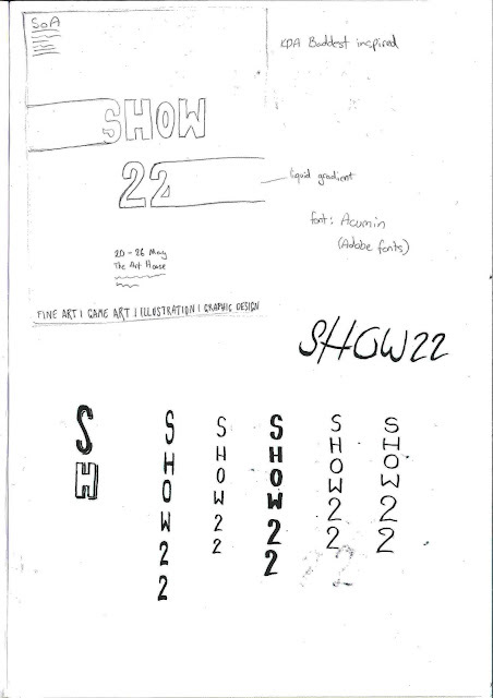
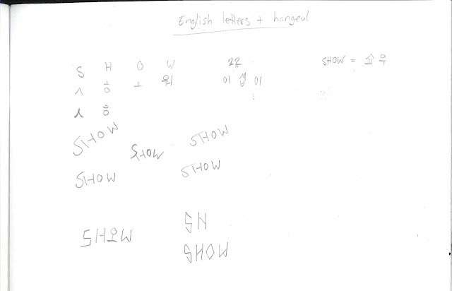
Trying to combine Hangeul with Roman lettters
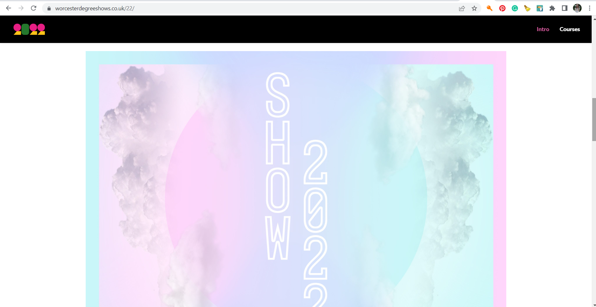
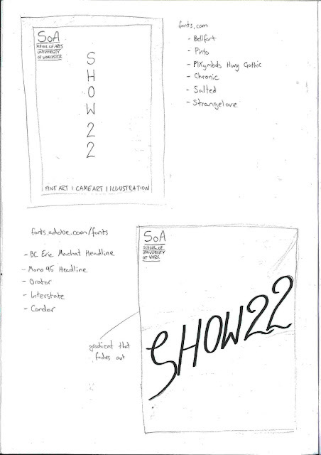
The finished poster took a while as there were many colour variations and figuring out the font and any additional textures etc. took a bit of trial and error. In the end, I think the finished poster I created is intriguing, it's different and it's creative. It didn't make the cover, due to extenuating circumstances, but it was featured on the degree show website.